您现在的位置是:网站首页> 编程资料编程资料
吃透移动端 1px的具体用法postcss-pxtorem移动端适配的实现移动端适配 使px自动转换remHtml5移动端适配IphoneX等机型的方法浅谈移动端适配大法html5实现移动端适配完美写法详解如何使用rem或viewport进行移动端适配
 2021-08-31
1068人已围观
2021-08-31
1068人已围观
简介 这篇文章主要介绍了吃透移动端 1px的具体用法,文中通过示例代码介绍的非常详细,对大家的学习或者工作具有一定的参考学习价值,需要的朋友们下面随着小编来一起学习学习吧
最近在写移动端 H5 应用,遇到一个值得记录下来的点。现在从它的由来到实现,我们来聊一下移动端 1px,说 1px 不够准确,应该说成 1 物理像素 。
通过阅读下面文章,你将会理解以下问题:
问题
- 为什么有 1px 这个问题?
- 实现 1px 有哪些方法?这些方法分别有哪些优缺点?
- 开源项目中使用的哪些解决方案?
- 如何在项目中处理 1px 的相关问题?
由来
基本概念
首先,我们要了解两个概念,一个是 像素(pixel) 可以简写为 px ,另外一个是 设备像素比(DPR)
像素 :指在由一个数字序列表示的图像中的一个最小单元,单位是 px,不可再次分割了。
设备像素比(DPR): 设备像素比 = 设备像素 / 设备独立像素。复制代码
下面我来简单解释下几个概念
- CSS 像素 (虚拟像素):指的是 CSS 样式代码中使用的逻辑像素,在 CSS 规范中,长度单位可以分为两类,绝对单位以及相对单位。px 是一个相对单位,相对的是设备像素。
- 设备像素 (物理像素):指设备能控制显示的最小物理单位,意指显示器上一个个的点。从屏幕在工厂生产出的那天起,它上面设备像素点就固定不变了,和屏幕尺寸大小有关。
- 设备独立像素 (逻辑像素):可以认为是计算机坐标系统中得一个点,这个点代表一个可以由程序使用的虚拟像素(比如: CSS 像素),这个点是没有固定大小的,越小越清晰,然后由相关系统转换为物理像素。 也就是说,当逻辑像素是 1pt 时,在 DPR 为 2 的 设备上显示为 2px 的物理像素
参考数据
各种类型的 iphone 手机屏幕设备的参数
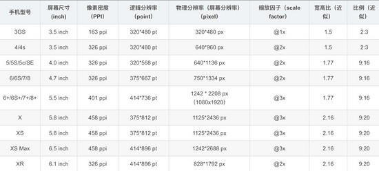
注:这里的缩放因子呢,就是 DRP 的值
设计稿对比数据
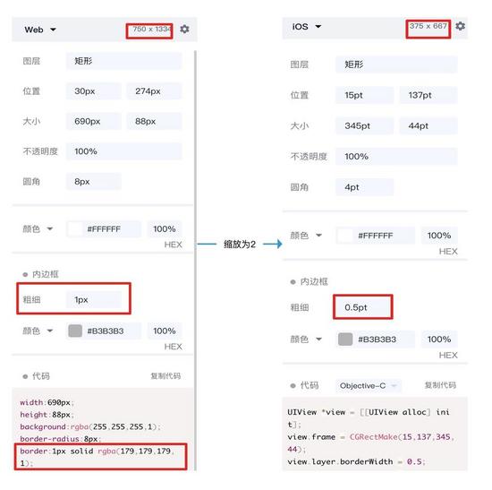
会有人好奇,为什么设计稿上显示是 750x1334 呢,这是因为设计稿是显示的 物理像素
而我们 css 中的像素是 逻辑像素 应该为 375x 667,在编写代码时要将自定义宽度设置成 375px
那么此时设计稿上的 1px 宽度实际代表的 css 参数应该是 0.5px 对应物理像素 1px,那么怎么实现这个物理像素为 1px 呢
实践
归根结底有两种方案,一种是利用 css 中的 transfrom:scaleY(0.5) ,另一种是设置 媒体查询根据不同 DPR 缩放
解决方案一
原理
利用 css 的 伪元素 ::after + transfrom 进行缩放
为什么用伪元素?因为伪元素 ::after 或 ::before 是独立于当前元素,可以单独对其缩放而不影响元素本身的缩放
伪元素大多数浏览器默认单引号也可以使用,和伪类一样形式,而且单引号兼容性(ie)更好些
实现
cell解决方案二(升级方案一)
原理
使用 less 对公共代码(方案一)封装,同时增加媒体查询分别对不同 DPR 的设备,进行不同的缩放
.border( @borderWidth: 1px; @borderStyle: solid; @borderColor: @lignt-gray-color; @borderRadius: 0) { position: relative; &:before { content: ''; position: absolute; width: 98%; height: 98%; top: 0; left: 0; transform-origin: left top; -webkit-transform-origin: left top; box-sizing: border-box; pointer-events: none; } @media (-webkit-min-device-pixel-ratio: 2) { &:before { width: 200%; height: 200%; -webkit-transform: scale(.5); } } @media (-webkit-min-device-pixel-ratio: 2.5) { &:before { width: 250%; height: 250%; -webkit-transform: scale(.4); } } @media (-webkit-min-device-pixel-ratio: 2.75) { &:before { width: 275%; height: 275%; -webkit-transform: scale(1 / 2.75); } } @media (-webkit-min-device-pixel-ratio: 3) { &:before { width: 300%; height: 300%; transform: scale(1 / 3); -webkit-transform: scale(1 / 3); } } .border-radius(@borderRadius); &:before { border-width: @borderWidth; border-style: @borderStyle; border-color: @borderColor; } } .border-all( @borderWidth: 1px; @borderStyle: solid; @borderColor: @lignt-gray-color; @borderRadius: 0) { .border(@borderWidth; @borderStyle; @borderColor; @borderRadius); }其他方案:
使用图片:兼容性最好,灵活行最差,不能改变颜色、长度
使用
viewport和rem,js动态改变viewport中scale缩放,缺点在于不适用于已有的项目,例如:使用vh和vw布局的使用 css 渐变
linear-gradient或者box-shadow上述 3 种方案均有致命缺陷暂不推荐使用
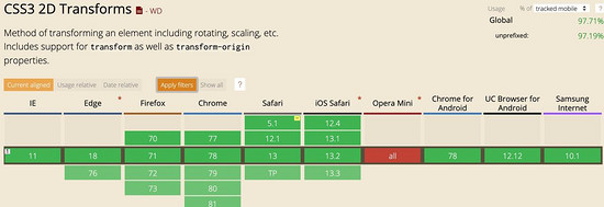
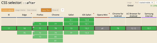
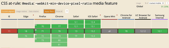
兼容性
最后看一下兼容性如何,主要是伪元素、
transform:scale和min-device-pixel-ratio这几个关键词的兼容性
开源库的解决方案
vant 组件库
使用
less写的.hairline-common() { position: absolute; box-sizing: border-box; content: ' '; pointer-events: none; } .hairline(@color: @border-color) { .hairline-common(); top: -50%; right: -50%; bottom: -50%; left: -50%; border: 0 solid @color; transform: scale(0.5); }也是采用第一种解决方案
ant-design-mobile 组件库
.scale-hairline-common(@color, @top, @right, @bottom, @left) { content: ''; position: absolute; background-color: @color; display: block; z-index: 1; top: @top; right: @right; bottom: @bottom; left: @left; } .hairline(@direction, @color: @border-color-base) when (@direction = 'top') { border-top: 1PX solid @color; html:not([data-scale]) & { @media (min-resolution: 2dppx) { border-top: none; &::before { .scale-hairline-common(@color, 0, auto, auto, 0); width: 100%; height: 1PX; transform-origin: 50% 50%; transform: scaleY(0.5); @media (min-resolution: 3dppx) { transform: scaleY(0.33); } } } } } .hairline(@direction, @color: @border-color-base) when (@direction = 'right') { border-right: 1PX solid @color; html:not([data-scale]) & { @media (min-resolution: 2dppx) { border-right: none; &::after { .scale-hairline-common(@color, 0, 0, auto, auto); width: 1PX; height: 100%; background: @color; transform-origin: 100% 50%; transform: scaleX(0.5); @media (min-resolution: 3dppx) { transform: scaleX(0.33); } } } } } .hairline(@direction, @color: @border-color-base) when (@direction = 'bottom') { border-bottom: 1PX solid @color; html:not([data-scale]) & { @media (min-resolution: 2dppx) { border-bottom: none; &::after { .scale-hairline-common(@color, auto, auto, 0, 0); width: 100%; height: 1PX; transform-origin: 50% 100%; transform: scaleY(0.5); @media (min-resolution: 3dppx) { transform: scaleY(0.33); } } } } } .hairline(@direction, @color: @border-color-base) when (@direction = 'left') { border-left: 1PX solid @color; html:not([data-scale]) & { @media (min-resolution: 2dppx) { border-left: none; &::before { .scale-hairline-common(@color, 0, auto, auto, 0); width: 1PX; height: 100%; transform-origin: 100% 50%; transform: scaleX(0.5); @media (min-resolution: 3dppx) { transform: scaleX(0.33); } } } } } .hairline(@direction, @color: @border-color-base, @radius: 0) when (@direction = 'all') { border: 1PX solid @color; border-radius: @radius; html:not([data-scale]) & { @media (min-resolution: 2dppx) { position: relative; border: none; &::before { content: ''; position: absolute; left: 0; top: 0; width: 200%; height: 200%; border: 1PX solid @color; border-radius: @radius * 2; transform-origin: 0 0; transform: scale(0.5); box-sizing: border-box; pointer-events: none; // @media (min-resolution: 3dppx) { // width: 300%; // height: 300%; // border-radius: @radius * 3; // transform: scale(0.33); // } } } } }这个值得研究下,比 vant 和 第一种解决方案有点不同,主要在于处理了 DPR 为 2 和为 3 的两种情况,相比来说更加完善。
这里 PX 大写,为了防止插件将 px 转成 rem 等单位
总结
通过该文,你大概了解 1px 问题的来龙去脉了吧,也明白了如何解决相关问题,如果这票文章能解决你的疑问或者工作中问题,不妨点个赞收藏下。
由于技术水平有限,文章中如有错误地方,请在评论区指出,感谢!
以上就是本文的全部内容,希望对大家的学习有所帮助,也希望大家多多支持。


相关内容
- 关于html字符串正则判断和匹配的具体使用html中的图片直接使用base64编码后的字符串代替基于HTML5 Canvas:字符串,路径,背景,图片的详解
- 处理textarea中的换行和空格如何让pre和textarea等HTML元素去掉滚动条自动换行自适应文本内容高度用CSS实现textArea中的placeholder换行功能关于textarea文本转为html即回车换行HTML里面Textarea换行问题总结如何在textarea文本输入区内实现换行
- VSCode 自定义html5模板的实现vscode怎么设置html标签自动补全? vscode自动补全html的技巧解决vscode 中保存后html自动格式化的问题VSCode怎么安装插件运行HTML文件?SublimeText3怎么快速输入html5格式?Sublime Text2怎么新建一个HTML头部文件?sublime / vscode 快捷生成HTML代码的实现
- HTML5 图片悬停放大的实现代码示例CSS3防疫知识图文响应式布局代码CSS3响应式个人名片图文布局代码详解CSS3实现响应式手风琴效果css3 响应式媒体查询的示例代码html用title属性实现鼠标悬停显示文字 html+css实现响应式卡片悬停效果
- Html5写一个简单的俄罗斯方块小游戏
- html5自定义video标签的海报与播放按钮功能html5移动端自适应布局的实现吃透移动端 Html5 响应式布局HTML5 通过Vedio标签实现视频循环播放的示例代码HTML5中在title标题标签里设置小图标的方法html5用video标签流式加载的实现详解HTML5 Canvas标签及基本使用详解HTML5布局和HTML5标签
- HTML5 3D旋转相册的实现示例微信小程序之html5 canvas绘图并保存到系统相册HTML5+css3:3D旋转木马效果相册HTML5 Plus 实现手机APP拍照或相册选择图片上传功能HTML5 CSS3打造相册效果附源码下载
- H5页面适配iPhoneX(就是那么简单)Html5 页面适配iPhoneX(就是那么简单)Html5移动端适配IphoneX等机型的方法Html5适配iphoneX刘海屏的简单实现简述Html5 IphoneX 适配方法有关HTML5页面在iPhoneX适配问题
- web字体加载方案优化小结html5实现点击弹出图片功能html5 录制mp3音频支持采样率和比特率设置html5表单的required属性使用html5调用摄像头实例代码HTML5页面音频自动播放的实现方式Html5大屏数据可视化开发的实现html实现弹窗的实例HTML5来实现本地文件读取和写入的实现方法HTML 罗盘式时钟的实现HTML5简单实现添加背景音乐的几种方法
- HTML5 Blob 实现文件下载功能的示例代码深入解析HTML5中的Blob对象的使用
点击排行
本栏推荐